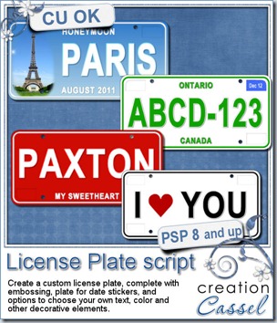
Do you have photos of a trip you took and want some fun ways to indicate where you went? These custom license plates would be perfect for you. But wait, these are TOTALLY customizable so why limit yourself to only plates that look like… license plates? Add the name of your loved one, add a date, add a short phrase, you can even add designs and photos on the background, you can add stickers for dates or other details.
With only your Paintshop Pro, and no outside filter, you can get an embossed plate “number” (even if it is not a number), embossed text on top and the bottom of the “number” (or both), but you can also add some flat painted designs in different colors and in different location. Just about everything is customizable, and on separate layers so even after the end of the script, you can still personalize the plate.
You can grab this unique script in my stores: Creation Cassel and DigiScrapWarehouse.
As usual, there is a free giveaway in the Happy Place where you can add your name and tell me how you would customize your license plate. On Monday night i will draw a winner. If you already purchased the script, you can still enter the draw because if you win, then you get a coupon for a future new release. How can you loose?
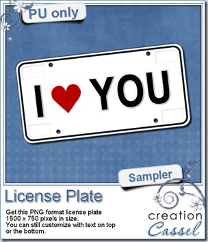 Since those plates are all about customization, i struggled a little bit to bring you a FREE custom plate design that you could still use. Of course, if i was to add the name of my husband, i doubt you would find many uses for it, so i though of something a little more generic so that you can use it as is, or almost as is. This plate has some white areas so you can add some flat text to it if you want. That is where you can add the name of your spouse, or your kid or parent, or dating partner. Or you can add the date of your wedding, the birthdate of your child, etc. Yeah, there are so many options! How will YOU customize this plate? Show me and i can make a whole display of custom plates.
You need to be logged in to download this sample. You can either login, or register on the top of this page.
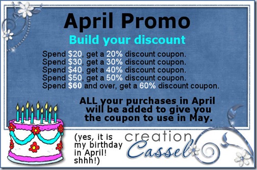
Do you have a wishlist in the store? You might want to seriously consider setting one up because April is coming soon. What about April? That is my birth month and if you were around last year, you will remember there was a BIG promotion going on in April and many of you managed GREAT deals. This year will be pretty much the same so get ready!
******************************
 Corel Shop Classes
Are you afraid of scripts?
Are you curious about scripts?
Are you wondering what scripts can do for you?
Corel has a series of Shop Classes (online workshops) on various topics and on April 2nd, the workshop is called “Introductions to scripts in Paintshop Pro” and i am totally excited to be the presenter (they even call me an EXPERT!) There will be people attending not only from the scrapbooking world, but also graphic and photography communities. We are expecting way over 100 attendees! It is in the evening so it might be a bit hard for our European friends, but don’t worry, the workshop will be recorded and uploaded to the Corel youtube channel probably the next day. Even if you dont think you can attend, just register so you can ask questions on the registration form. We will try to answer the questions from the forms so even if you are not there to hear the answer live, you will get it in the recording. If you do not type in your most pressing question, we might not answer it because maybe nobody else had the same question. That would be too bad, wouldn’t it be?
Just hit this button to register for that workshop, organised by the Corel Corporation. Remember… it is FREE

(i heard there should be a draw among the attendees… shhh!)
****************************
News from the Campus
Campus workshop
Although you can join the Corel Shop Class on April 2nd, there is still our regular monthly workshop in the Campus. This month, it will be on April 1st (yes, you will be spoiled with TWO workshops in a row specially for Paintshop Pro users!) We will be looking at colorization which will be very useful for designers and scrappers too. This will allow you to increase considerably the ways you can use your current supplies. You will be able to reuse them without feeling like you are “just” copying and pasting them yet another time. The live workshop will allow you to ask questions directly and see them answered immediately. Join us and register now.

If you cannot attend, the workshop will be recorded and edited and likely reuploaded one week after the live presentation. A detailed handout will also be available for purchase.
In the mean time, the edited recording of the workshop on Vectors is still available for FREE to any registered member. When the Colorizing workshop is uploaded, the Vector one will no longer be free.
Element Creation Tutorial
Last week, our students were offered two fantastic tutorials instead of one. Look at these!
What will it be this week?
Writer Call
Did you notice our call last week? We are looking for a passionate scrapper who can write articles on the various elements used in scrapbooking and created in the Element Creation tutorials section. Are you that scrapper? Are you able to think of creative ways to use some ordinary elements? Just apply for this position. In exchange of your enthusiasm, you will get a FREE UNLIMITED membership to the Element Creation Tutorials section (for as long as you want to keep writing). If you are interested, just email me at [email protected] The call is open for another week, until March 31st, so get your applications in.
New course coming soon
Keep an eye on the Campus as i am very excited to bring in a brand new course. This is a course that i was asked several time to give and i always declined, but this time, i am bringing in a real expert, and SHE will be the teacher, not me. I am not yet telling you as the classroom is not yet set up, but you might hear a few bangs, smell some fresh paint, and even see some dust. It will not be long.
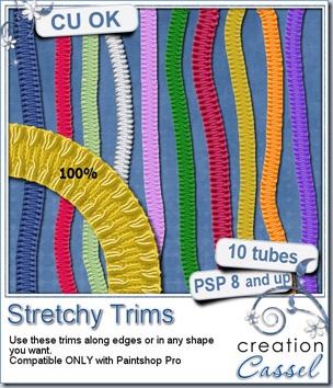
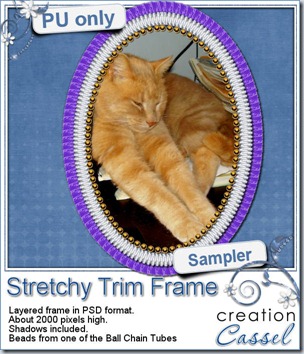 As usual, here is a freebie for you to check this out. This is a layered frame with two layers of stretchy trims, and one layer with some Ball Chain tubes too. Mix and match as you can hide one or two layers. This frame is in PSD format so any non-PSP user can actually enjoy it. The file also includes a template for the center so you can trim your photo easily to match the frame shape.




 Since those plates are all about customization, i struggled a little bit to bring you a FREE custom plate design that you could still use. Of course, if i was to add the name of my husband, i doubt you would find many uses for it, so i though of something a little more generic so that you can use it as is, or almost as is. This plate has some white areas so you can add some flat text to it if you want. That is where you can add the name of your spouse, or your kid or parent, or dating partner. Or you can add the date of your wedding, the birthdate of your child, etc. Yeah, there are so many options! How will YOU customize this plate? Show me and i can make a whole display of custom plates.


 I am sure you would love to win this script, right? Just hop over the Happy Place thread

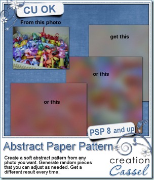
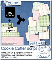
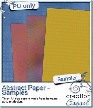 Do you want to see what this script can do? I am sure you do. You always like to get a free sample too, so i made those three papers from the exact papers displayed in the script preview. For one paper (the yellow one), i just added a Reflection Effect – Pattern. For the multicolored one, i applied the Topography effect and added a texture. For the pinkish one, i just reduced the opacity very low, changed the blend mode and added a texture.
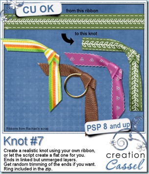
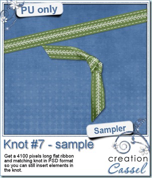

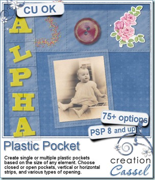
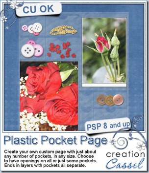
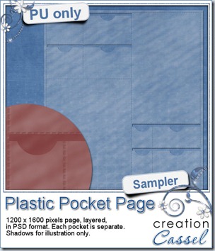
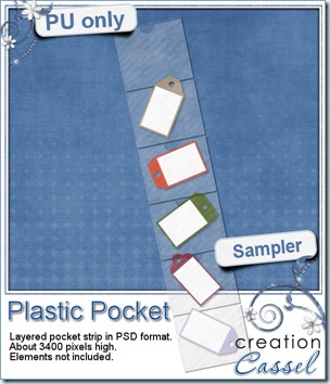 I know you would like to see one of those pockets on your layout and play with it. You are lucky because i created this multiple pocket for you. It consists of two separate layers, in PSD format, so anyone can use it, even if you don’t have Paintshop Pro.