Did you ever rub a crayon or a pencil on a piece of paper with an object underneath just to see the details of the texture appear? What kind of objects do you remember using?
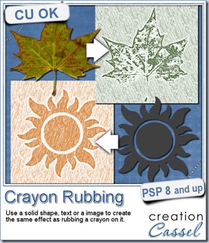
Doing that with Paintshop Pro is now very easy as this script will do all the work for you. Use a solid shape or an image and choose your “crayon” color.
Once the script is done, you get a heavily rubbed shape or design and a lightly rubbed background. You can remove the background altogether (since it is only a separate layer) or you can erase the excess and leave only a little bit. You can also “rub” another area as the script will leave the material with the exact same setting as what it used for the background.
You can grab this Crayon Rubbing script in my store.
 Do you want a chance to win this script? Just tell me what you would use it in a scrapbook project, in this thread. I’ll be back next week with the name of a winner.
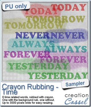
As a sample of this, i created some time-related words for you. You get the same words with and without the background paper. They are in PNG format, so they are useable in most programs. And they are very large (up to 3000 pixels) so you can use them as large title on a layout, or you can resize them down.
Each one has a different color (although you can still colorize them differently if you want) and has a different angle of crayon marks.
You need to be logged in to download this sample. You can either login, or register on the top of this page.
 Did you download your free Bokeh papers on myFacebook page? I said that once i reach 400 fans, i would add another set of papers. I am pleased to announce that this milestone has been reached, so, as promised, i will add another set this weekend.
Thanks so much for joining my store page!
And thanks for sharing it!
It is much appreciated.
Keep sending your PSP friends to “like” it.

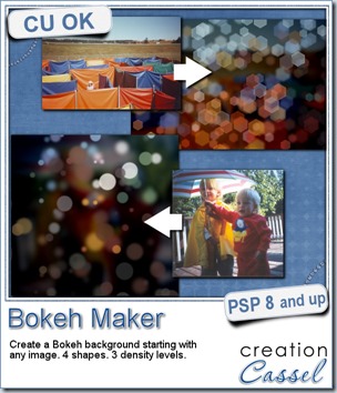
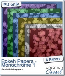
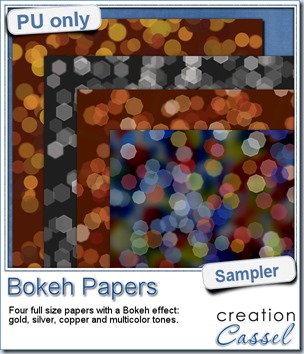 For this week’s free sampler, i created four full size papers for you. Since i dont really know what type of photos you have to use in a layout, i decided to create three of those papers using just gradients i had in my stash: one for silver, one for gold and one for copper. Once i had a paper made out of those gradients, i just ran the script on it.

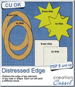
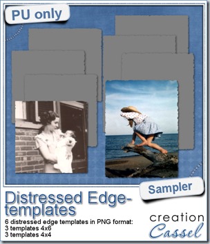 One neat use for the distressed edge is that although you can use it directly on the element you want to have irregular edges, you can also create your own templates for shapes you might want to use in the future. In fact, that is what i did for you. Since i could not show you a sample on YOUR elements, i made some grey templates. They are for 4x4 and 4x6 photos. If you are into pocket scrapbooking, or Project life or using Instagram, you will surely find some use for those. Use them for photos or journaling cards.
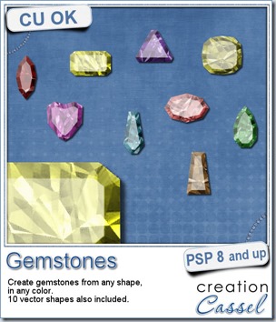
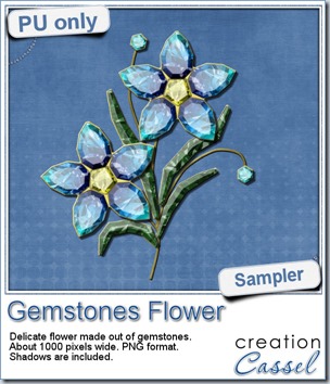 This week, i had a lot of fun creating your free sample and i am super happy with the result. I created these gem flowers using the script. Here are some tips i used to get such a great result:
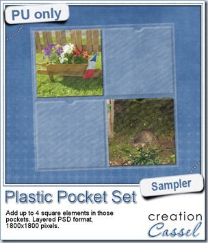
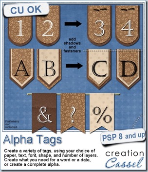
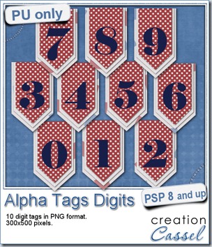 As a sample, i made this set of digits based on papers from an old kit of mine. The basic blue, white and red should make these tags very versatile. The shadows are added to the inside layers but not the outside ones. That will allow you to add a fancy shadow, making the tags lift off the papers.
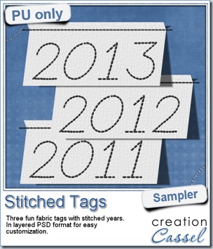 As a sample, this week, i created a set of simple fabric tags with the years. They are in layered PSD format so the tag, the stitching on top and the shadow are on different layers. This should allow you to colorize the tags and the stitching without affecting the shadow and you can also add your own shadow if you need to rotate the tags.
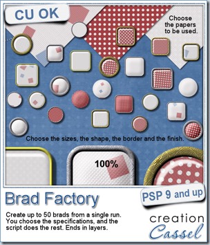
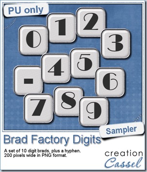 One great advantage of this script is how it leaves all the layers intact, allowing you to tweak or use them in different ways. That is what i did with this sample. I ran the script on several papers i had (see the preview) and chose a simple, neutral one, with acrylic finish and i turned it into a set of digits but just adding the characters below the acrylic layer. It was soooooo easy.
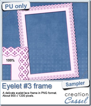 How about a little sample of what this script can do? I ran the script on a long piece of textured solid color to create a ribbon. I did the same thing twice, to get a top and a bottom edge with proper bevelling (NEVER flip or mirror an element that has been shadowed or bevelled). Then, using a copy of the ribbons, i applied a different bevel angle before merging and rotating the copies to make the vertical edges of the frame. Then, it was just a matter of applying a mitered corner technique to align and cut the corners correctly. What do you think of it?