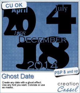
 You always need to find something different and original to add a date to a project. This is one of those unusual options.
The Paitnshop Pro script will help you create a date where the actual number will be the focus while the month and the year will overlap and cutout from the number. Even better, you can choose ANY font for each of the elements.
The year, at the bottom, is only optional.
The end result is a single raster layer so you can use it as is, colorize it, use it as a mask and more. It is a great idea to create journaling cards for a “Project Life” or to date photos in a “Project 365”.
In fact, you can also use other words than months. For example, you can use the word MONTH, or WEEK, or GRADE to associate with other kinds of numbers.
Grab this script in the store: Ghost Date.
Do you want to have a chance at getting this script for free? Just add a comment below giving me ideas of how you would use such a script. Who knows? I might just create it for all to share? The winner will be announced in the newsletter, next week. Not a subscriber yet? Not a problem. You can register here and it is free (and you only get one email per week).
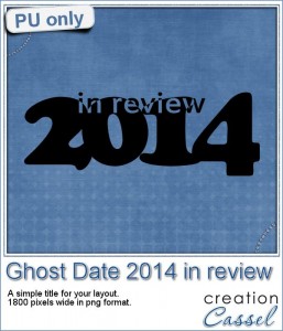
 For a sample, this week, i went a bit outside of the box with the script: i didn’t create an actual date.
Instead of a date, i put the year, and instead of the month, i used the word “in review”.
This is a great time to create a layout (even a double size layout) with the highlights of the year, things you want to remember, people you met, places you visited. Then, you can use this element as a title on top, or why not in the middle?
You need to be logged in to download this sample. You can either login, or register on the top of this page.
If you create such a year in review project, remember to show us!


I love this script! I scrapbook chronologically and I can see that this would be wonderful in my yearly books. I can’t think of different ways to use it yet, but I am looking forward to reading other’s replies and comments.
And I also wanted to say thank you for the great tip for the crop tool. I sometimes go thru and crop png files when I purchase a kit because the designer has left so much space around it. This is much easier and faster than how I have been doing it.
Great idea, I think it would be great to make wordarts. I already made something similar once with text but it’s long to make it each time.
This script looks SO cool! I love the way the letters flow over each other. I am thinking I would like to make a graduation/2014 (or my college’s name and then Grad 2014) that I could use for my graduation layouts/photos I’ll be doing soon!